


What Is the Difference Between MACD and RSI?
FXOpen
In the dynamic world of trading, traders utilise diverse instruments to skillfully navigate the ever-changing market landscape. Within this toolbox, technical analysis shines as a crucial instrument, assisting traders in comprehending past price dynamics, chart patterns, and current market trends. This approach equips traders with the ability to craft educated forecasts concerning possible price fluctuations. This article aims to shed light on how to read RSI and MACD, providing insights into how these indicators may be harnessed to interpret and anticipate market trends.
What Is the MACD?
The MACD indicator is a popular tool used by traders to analyse and interpret market trends. It consists of three main components: two lines and a histogram. Here's a breakdown of each component:
- MACD Line: The MACD line is calculated by subtracting a long-term Exponential Moving Average (EMA) from a short-term EMA. The resulting MACD line represents the difference between these two EMAs and provides insights into the momentum and direction of a trend.
- Signal Line (Trigger Line): The signal line is a smoothed moving average of the MACD line. It is calculated by applying a moving average to the MACD line itself. Commonly, a 9-period EMA is used to smooth out the MACD, providing a more stable signal. It helps traders identify potential buy or sell signals based on its crossovers with the MACD line.
- Histogram: The histogram depicts the difference between the MACD and signal lines. It is plotted as vertical bars above or below the zero line. When the MACD line crosses above the signal line, the histogram bars are positive, indicating bullish momentum. Conversely, when the MACD line crosses below the signal one, the bars are negative, indicating bearish momentum. The height of the bars represents the strength of the momentum.
To better understand the MACD indicator, it's important to grasp its foundation in Exponential Moving Averages (EMAs). The indicator's interpretation revolves around the interactions between the MACD line and the signal line, as well as the patterns and trends displayed by the histogram bars.
How to Use the MACD
Traders may implement the Moving Average Convergence Divergence by applying the following approaches:
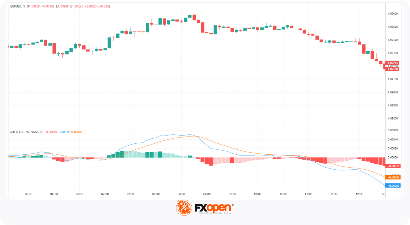
- MACD and Signal Line Crossovers: One of the primary uses of the MACD indicator is to identify potential trend changes through crossovers between the MACD and signal lines. As the indicator line crosses above the signal line, it is called a bullish crossover, indicating potential upward momentum. When the indicator line crosses below the signal line, it is called a bearish crossover, suggesting a possible downward momentum. The chart below shows the MACD line as blue and the signal line as orange. Notice how the crossover shows the changing market trends.
- Divergence: Divergence occurs when the price of an asset moves in the opposite direction of the Moving Average Convergence Divergence. When the price makes lower lows while the indicator makes higher lows, it is called bullish divergence. When the price makes higher highs while the indicator makes lower highs, it is referred to as bearish divergence. Divergence can indicate potential reversals in the current trend. The chart below shows a case of bearish divergence where the market makes higher highs, and the indicator creates lower lows.

- Overbought/Oversold Conditions: The histogram can help traders identify overbought and oversold conditions. Positive histogram bars indicate a bullish move, while negative bars suggest a bearish move. Extremely high positive or negative values may highlight possible overbought or oversold conditions. The H4 USDJPY chart below shows a u-turn from an up to a downtrend. The highlighted area matches the point where the green bars are at an extreme high.

Consequently, the chart below shows an opposite case when the histogram bars are displayed with a deep red colour. This highlights a u-turn from a down to an uptrend.

What Is the Relative Strength Index?
The Relative Strength Index (RSI) is another common oscillator in technical analysis. It measures the speed and magnitude of price movements while oscillating between 0 and 100. The RSI is typically displayed as a single line on a separate scale below the price chart.
How to Use the Relative Strength Index
Traders may implement the Relative Strength Index by applying the following approaches:
- Overbought/Oversold Conditions: The RSI is widely used to identify overbought and oversold conditions. Values above 70 are considered a sign of an overbought asset, and values below 30 usually signal that the asset is oversold. These levels may help traders anticipate potential reversals or corrections. The chart below shows the particular cases where the RSI indicates an overbought and oversold condition, respectively.
You can use the TickTrader platform by FXOpen to examine the RSI indicator.

- Divergence: The Relative Strength Index may also provide divergence signals. A bullish divergence occurs when the instrument makes lower lows while the RSI makes higher lows. Bearish divergence happens when the financial instrument makes higher highs while the indicator makes lower highs. Divergence can be indicative of potential trend reversals. The M5 GBPUSD chart below shows a case of bearish divergence.

- Trend Direction: The RSI has a midpoint at the 50 level. When the RSI crosses above 50, it suggests that the average gains are outweighing the average losses, indicating upward momentum. Conversely, when the RSI crosses below 50, it suggests that the average losses are outweighing the average gains, indicating downward momentum. This can be used to assess the general trend direction.

The red and green rectangles in the chart below highlight the areas where the RSI values are above and below 50.
Differences Between RSI and MACD
The table below shows the MACD indicator vs RSI indicator in comparison.
How to Use MACD and RSI Together
Incorporating the MACD and RSI strategy into your trading plan may be useful. Combining them to confirm price momentum is a key practice, where alignment in their signals enhances confidence in decision-making.

A trader uses MACD and RSI indicators to place a buy trade on USDJPY. They enter the trade when the MACD is green with the RSI above 50. The breakout of the key level by the candlestick also provides additional confluence. They exit the trade when the MACD creates red bars highlighting a potential reversal, while the RSI indicator leaves the overbought area.
Final Thoughts
To make informed choices, traders should also consider other technical indicators, conduct fundamental analysis, and take into account prevailing market conditions. A thorough grasp of both indicators and their interrelation can empower traders to better identify potential trading opportunities and manage risks in a more effective manner. When you feel confident, you may open an FXOpen account and apply these indicators to various instruments.
This article represents the opinion of the Companies operating under the FXOpen brand only. It is not to be construed as an offer, solicitation, or recommendation with respect to products and services provided by the Companies operating under the FXOpen brand, nor is it to be considered financial advice.
Stay ahead of the market!
Subscribe now to our mailing list and receive the latest market news and insights delivered directly to your inbox.


Latest articles

Intel at a Crossroads: Earnings Beat Meets Technical Resistance
Intel has just delivered its strongest quarter in over fifteen years, and the market reaction says it all. Q2 2026 revenue surged 25% year-over-year to $16.1 billion, crushing the consensus estimate of $14.42 billion, while adjusted EPS of

Tesla: Complex Range Structure Breaks Down Following Quarterly Earnings
Tesla released its Q2 2026 results after the market closed on 22 July. Revenue increased 26% year-on-year to $28.24 billion, while vehicle deliveries reached a record 480,126 units. However, operating margin fell sharply to 1.4%, down from

Pound Weakens After Soft UK Inflation Data as Euro Awaits Fresh Market Signals
The pound remains under pressure following the release of weaker-than-expected UK inflation data. The slowdown in inflation has strengthened expectations that the Bank of England could adopt a more accommodative policy stance in the coming months, weighing on sterling. Meanwhile,