


Bollinger Bands on 4H chart
FXOpen

Swing traders may find 4H charts very useful as they help to determine price movements without paying too much attention to economic data. It would not be wise to ignore fundamentals, because in a way, political intervention in the markets occurs quite often.
I would like to note that every 7 days we could draw new lines of support and resistance in order to seek new opportunities for entries.
- 1 day is equivalent to 24 hours;
- 6 candles (4H chart) are equivalent to 1 day;
- 5 days are equivalent to 30 candles (4H charts).
If you can forecast correctly 5 or 6 candles in 5 days, then you are good enough at trading.
Let’s examine some interesting entries on 4H candles.
Case 1: EURUSD

When prices are below the SMA then there is a greater probability that the movement will continue declining. Particularly, if you see a red candle after a blue candle formation, we are almost sure that bears are dominating. We could have a bearish reversal pattern in this case.
Similarly, a blue candle formed after a red candle indicates a higher probability of a long setup.
But you cannot predict within a few moments what candle formation is going to be. Then wait a bit more and make trades after the pattern becomes clear.
Case 2: AUDUSD
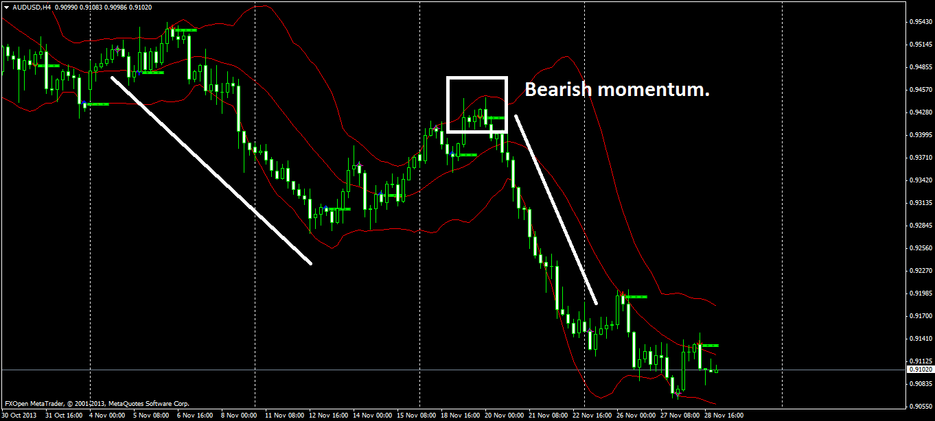
Using Bollinger bands, it was possible to detect an upper limit confirming further sellers’ activity around Aussie. See the white box: it indicates that blue candles are exhausted. Moreover, a bearish reversal was created. The bearish sentiment was very strong for days, which was followed by strong sales.
The Bands idea is simple to use. We are interested in knowing what the daily upper and lower limits are. The drawn lines help us to know which direction the currency is going to take. If the lower limit is reached after an oversold, then there are greater chances for a bullish reversal. If the upper limit is reached after an overbought, so new sellers will assume the scene. The problem is: what the actual supply and demand levels are?
If you notice that the trading volume in the 4H chart is overbought or oversold, so the supply and demand levels could be clearly designed for a period of approximately 7 days.
What I am writing is based on the collection of observations made on a daily basis. If there is any mistake, so write what you think.
Case 3: XAUUSD
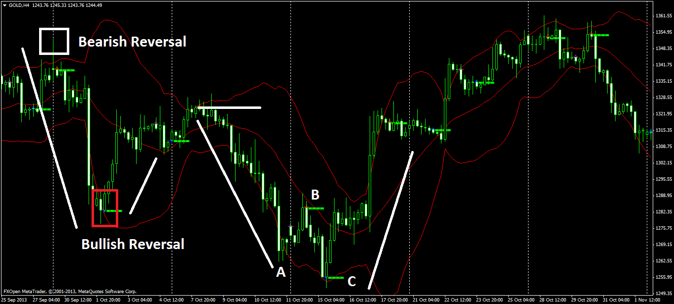
The upper limit was designed due to Bollinger bands. I used a white box to indicate how exhausted the bulls are. Within the next 7 days there was devaluation due to policymakers’ intervention.
After an oversold, I drew a red box indicating that bulls were dominating with positive breakout (a curve correction).
Case 4: EURJPY
An interesting case involves the Yen currency. This year, the Yen has been enough depreciating. IT was possible to draw a strong uptrend for 21 consecutive days in the 4H graph. After observing the lower limit with the help of bands I’ve noticed breakouts up. As a result, EURJPY has obtained high profits.

The above observations can help to create new entries using Bollinger bands on a 4H chart. NO doubt that detecting the upper and lower limits are important to read the over valuation of a currency.
The article is written by Igor Titara and is participating in the Forex Article Contest. Good luck!
This article represents the opinion of the Companies operating under the FXOpen brand only. It is not to be construed as an offer, solicitation, or recommendation with respect to products and services provided by the Companies operating under the FXOpen brand, nor is it to be considered financial advice.
Stay ahead of the market!
Subscribe now to our mailing list and receive the latest market news and insights delivered directly to your inbox.

Latest articles

AUD/USD and NZD/USD Flash Early Signs of Bullish Recovery
AUD/USD is attempting a fresh increase from 0.7115. NZD/USD is consolidating and could aim for a move above 0.5930 in the short term.
Important Takeaways for AUD/USD and NZD/USD Analysis Today
• The Aussie Dollar
DAX Uptrend at Risk from Fundamentals
March proved to be one of the weakest months for the German index in recent years, though conditions stabilised by mid-April. At present, the DAX (Germany 40 mini on FXOpen) is showing a solid recovery, trading around 24,650. The

Market Analysis: Gold Slips While WTI Crude Oil Eyes Fresh Upside
Gold price extended losses below $4,800 before the bulls appeared. WTI Crude oil prices are rising and could climb further higher toward $92.00.
Important Takeaways for Gold and WTI Crude Oil Prices Analysis Today
· Gold price failed to