


How to Use the Bullish Rectangle Chart Pattern
FXOpen
A bullish rectangle is a chart formation that provides valuable insights into the future direction of a financial market. Traders can identify exact entry points and use this setup to trade on breakouts. In this FXOpen article, you will learn what the bullish rectangle setup is and explore its key characteristics and trading methods.
What Is a Bullish Rectangle Chart Pattern?
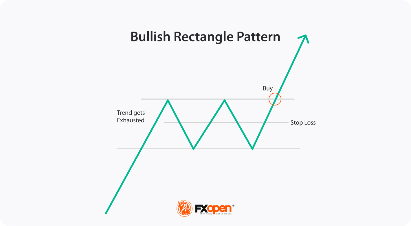
A bullish rectangle is a continuation chart setup that suggests a temporary pause or consolidation in an uptrend before it resumes. The price forms a rectangular-shaped trading range with near-equal highs and lows.
How to Identify a Bullish Rectangle Continuation Pattern
To identify this setup, traders look for these criteria:
- Prior uptrend: The market should move in an upward trend before forming the shape.
- Rectangular shape: The price should form near equal highs and lows, creating a rectangular consolidation shape.
- Volume: Trading volume tends to diminish during the consolidation phase.
- Breakout: Traders expect the price to break above the upper boundary as a signal to enter long positions.
The setup can be spotted on any timeframe and on a chart of any financial instrument. That is, you can identify a bullish rectangle pattern in forex or define a stock bullish rectangle formation.
Bullish Rectangle vs Bearish Rectangle
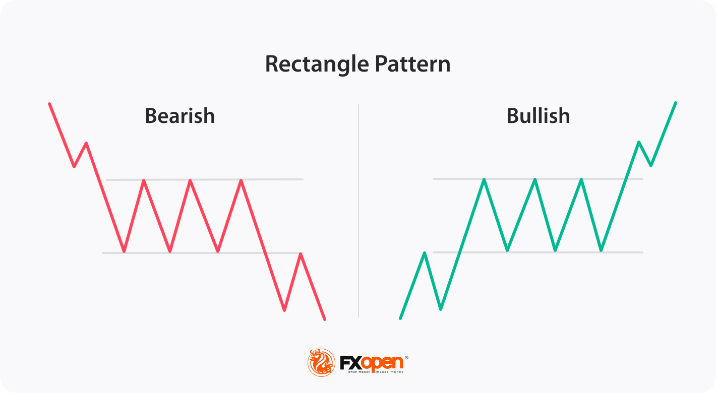
The bullish and bearish rectangles are opposite setups in technical analysis. A major difference between them is their prevailing trend, including the direction of an eventual breakout. While the bull alternative occurs in an upward trend, and then gets confirmed with an eventual upside or resistance breakout, the bearish setup appears in a downtrend and may be confirmed by a downside breakout.
While both have similar shapes, it can be seen that they indicate different things. The TickTrader trading platform allows traders to learn how to spot patterns on charts of different assets to trade them right away.
How to Trade the Bullish Rectangle
As this setup predicts a potential continuation of an uptrend, the theory states that it can be traded in these steps:
Entry
After identifying an upward trend alongside prices fluctuating within equal highs and lows together with a break above the resistance line, traders enter a buy trade.
Profit Target
Traders usually measure the height of the rectangle and use it as the shortest possible price move after the breakout. However, traders can use technical analysis tools such as Fibonacci retracement or previous resistance levels to establish their targets.
Stop Loss
It’s generally advisable to secure a trade, including managing a position, with a stop-loss level. The theory states that the level can vary depending on the market conditions, but the common rule is to place it slightly below the resistance of the rectangle or to set it on the support of the rectangle if a significant rise is expected.
Live Example

Let’s consider a live-market bullish rectangle example. In the chart above, you can identify the rectangle formed due to a pause in an uptrend. After drawing the support together with resistance lines, a trader entered a trade at the closing of the breakout candlestick. The take-profit target equals the height of the rectangle, while a stop-loss order is placed slightly below the rectangle’s upper boundary to fit a 1:2 risk/reward ratio.
You can open an FXOpen account and adopt this formation to improve your trading approach.
Summary
The bullish rectangle pattern can help traders identify potential bullish breakouts. By understanding its key features, market participants can identify opportunities to enter the market with a favourable risk-to-reward ratio. However, like any technical analysis tool, this setup is usually used in conjunction with other indicators and risk management strategies to maximise its effectiveness.
FAQ
What is a bullish rectangle pattern?
A bullish rectangle is a chart formation that forms when the market consolidates during an uptrend and is shaped with support and resistance lines. The prevailing trend generally suggests further upward movement. When the price breaks above the resistance, it is supposed to keep rising. Therefore, traders use it to enter long trades.
How do you trade with bullish rectangle patterns?
To trade the bullish rectangle, you may follow these steps:
- Identify: Look for a rectangular consolidation phase with equal highs and lows within an upward trend.
- Confirm: Use additional indicators or chart formations to validate the shape.
- Enter trade: Place a long position when the breakout occurs above the upper boundary.
- Set a profit target: Determine a realistic target based on the projected price move after the breakout. Usually, the target equals the rectangle height and is measured from the resistance line. However, if the trend is strong, it can be increased.
- Set a stop loss: Place a stop-loss order below its upper boundary or on the lower boundary to limit potential losses.
What does a rectangle pattern mean?
A rectangle is a consolidation formation used in technical chart analysis. It occurs when the asset trades within a relatively narrow range with well-defined horizontal support and resistance levels. It resembles a rectangular shape on the price chart, hence its name. Rectangles, bullish or bearish, signal a trend continuation.
This article represents the opinion of the Companies operating under the FXOpen brand only. It is not to be construed as an offer, solicitation, or recommendation with respect to products and services provided by the Companies operating under the FXOpen brand, nor is it to be considered financial advice.
Stay ahead of the market!
Subscribe now to our mailing list and receive the latest market news and insights delivered directly to your inbox.


Latest articles
USD/CAD: One Trendline Away From Deciding the Next Move
After several strongly positive weeks, USD/CAD has stalled over the past few sessions, entering a phase of uncertainty.
On the dollar side, Fed Chair Kevin Warsh has struck a firm tone, reaffirming the 2% inflation target and pushing back

Amazon: New Bond Issuance to Fund AI Infrastructure
On 7 July, Amazon announced an eight-tranche bond offering worth at least $25 billion, with the proceeds expected to finance the construction of data centres and the expansion of its artificial intelligence infrastructure. Investor demand peaked at $62 billion, highlighting

Weekly Market Insights with Gary Thomson: US Inflation, UK GDP, Chair Warsh Testimony, and Earnings
In this video, we’ll explore the key economic events and market trends, shaping the financial landscape. Get ready for insights into financial markets to help you navigate the week ahead. Let’s dive in!
In this episode of Market