Crypto Chart Patterns and Their Use in Trading
FXOpen

Chart patterns are powerful tools in trading, providing visual cues about potential market movements. Crypto trading patterns offer a way for traders to better understand market sentiment and anticipate price shifts in volatile crypto markets. This article explores key chart patterns, their significance, and their formations.
Classic Crypto Trading Chart Patterns
First, let’s take a look at some of the most common bearish and bullish crypto patterns. For the best understanding, consider following along with live crypto charts in FXOpen’s free TickTrader platform.
Triangles
Triangles are one of the most common crypto chart patterns traders encounter, and they’re all about compression and anticipation. These patterns form when price action tightens between two converging trendlines, creating a triangle shape on the chart. The key idea here is that the market is coiling up, and when it finally breaks out of the triangle, a significant move often follows.
The three most common types of triangles are ascending, descending, and symmetrical.
An ascending triangle forms when there’s a flat resistance level on top, but the lows keep getting higher. This suggests that buyers are becoming more aggressive, and a breakout to the upside is often expected. Validation occurs when the resistance level is broken through. The ascending triangle is commonly a continuation pattern.
A descending triangle is the opposite. Here, the support level is flat, but the highs are getting lower. This formation indicates that sellers are pushing harder, and the price might break downwards. Traders look to trade this formation when the support level is traded through. The descending triangle is commonly a continuation pattern.
Finally, the symmetrical triangle has neither a flat top nor a flat bottom. Instead, both the highs and lows are converging towards a point, showing indecision in the market. The direction of the breakout could go either way, and traders often wait for that breakout to signal their next move. However, as triangles are usually continuation patterns, the breakout direction may be identified in advance.
Head and Shoulders and Inverse Head and Shoulders
The Head and Shoulders pattern is one of the most recognisable and reliable chart patterns in trading. It gets its name because it resembles a head with two shoulders on either side. Here’s how it works: the price makes a peak (the left shoulder), followed by a higher peak (the head), and then a lower peak (the right shoulder). This formation signals that the trend may be about to reverse from bullish to bearish, as buyers struggle to push the price higher after the head is formed.
The Inverse Head and Shoulders is just the flipped version. Instead of signalling a bearish reversal, this pattern suggests a bullish reversal. The price drops to form a low (left shoulder), then dips even further (the head), and finally forms a higher low (right shoulder). This formation indicates that sellers are losing steam, and the market may be ready to move upward.
Both crypto patterns are valuable because they offer clear visual cues that a trend might be shifting. Traders often look for the price to break the neckline—the line that connects the two troughs or peaks between shoulders—before considering the pattern confirmed and acting on it.
Double Top and Double Bottom
The Double Top and Double Bottom patterns are straightforward but powerful signals of potential trend reversals.
A Double Top forms when the price rises to the same point twice, creating two peaks. This suggests that the upward momentum is weakening, and a reversal to the downside might be on the horizon. Conversely, a Double Bottom occurs when the price hits the same low point twice, signalling that the downtrend could be losing steam, with an upward reversal potentially coming next.
For both patterns, validation happens when the price breaks through the support (in the case of a Double Top) or resistance (in the case of a Double Bottom) level between the two peaks or troughs. This breakout confirms the pattern and indicates that the market is likely to continue in the direction of the breakout.
Triple Top and Triple Bottom
The Triple Top and Triple Bottom patterns are extensions of the double patterns, showing an even stronger potential for a reversal.
A Triple Top forms when the price peaks three times at a similar level, unable to break through resistance, indicating that buyers are losing strength. A Triple Bottom occurs when the price hits a similar low three times, suggesting that sellers are struggling to push the price lower.
Validation for these patterns happens when the price breaks below the support level in a Triple Top or above the resistance level in a Triple Bottom. This breakout confirms the pattern and signals a potential trend reversal in the direction of the breakout.
Rising Wedge and Falling Wedge
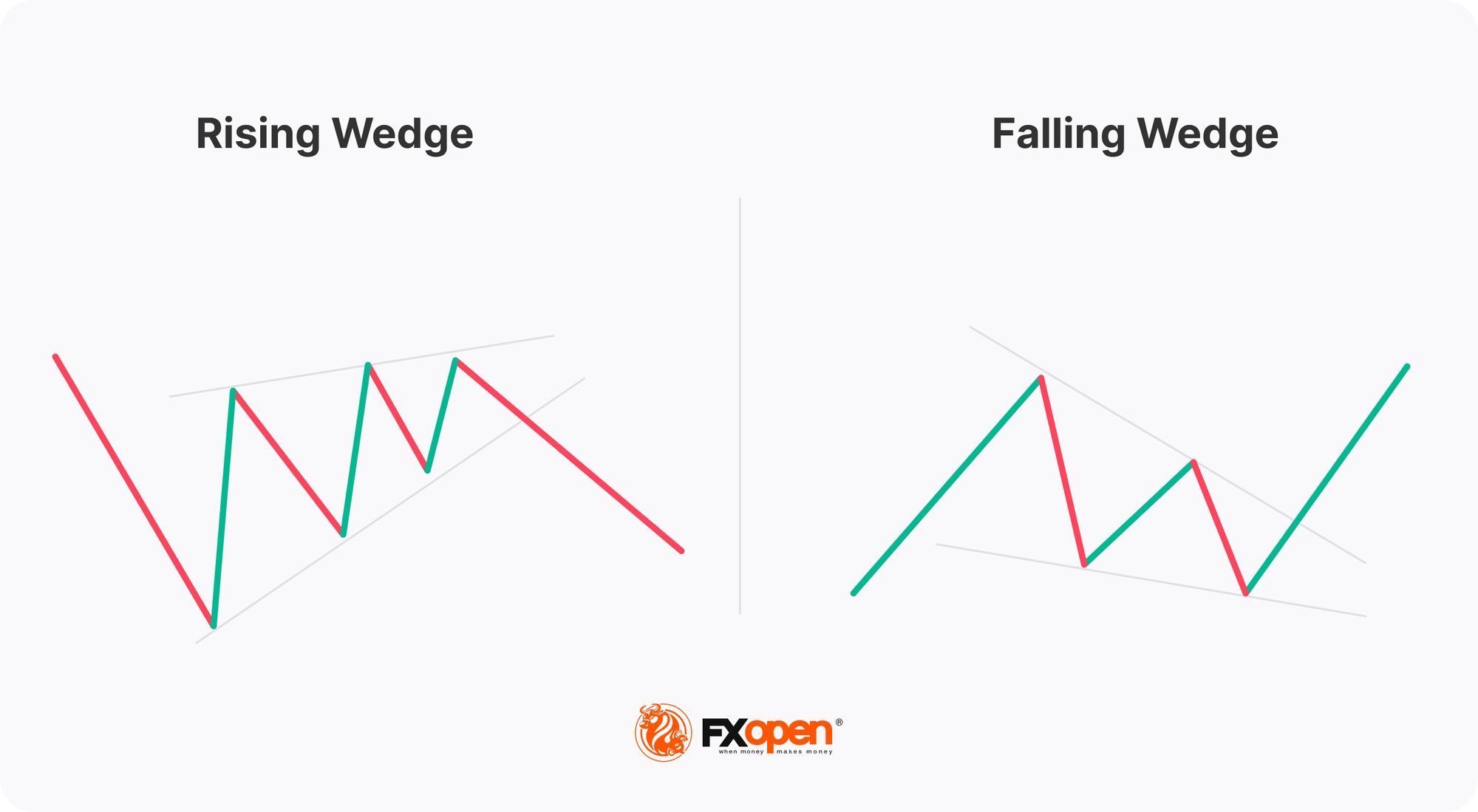
The Rising Wedge and Falling Wedge patterns typically signal potential trend reversals. They are characterised by converging trendlines that show a narrowing price range.
A Rising Wedge forms when the price makes higher highs and higher lows, but the upward momentum is gradually weakening as the trendlines converge. This pattern often indicates a potential bearish reversal, where the price could break downward once the wedge is completed.
On the flip side, a Falling Wedge occurs when the price creates lower highs and lower lows, but the downward momentum is losing steam as the trendlines converge. This crypto pattern suggests a potential bullish reversal, where the price may break upward after the wedge finishes forming.

Validation occurs when the price breaks through the lower trendline in a Rising Wedge or the upper trendline in a Falling Wedge, confirming the potential reversal.
Bullish Flag and Bearish Flag
The Bullish Flag and Bearish Flag patterns are continuation patterns that signal a temporary pause in the market before the previous trend resumes.
A Bullish Flag forms after a strong upward move, where the price consolidates in a small downward-sloping channel. This formation suggests that the market is taking a breather before potentially continuing its upward trend.
A Bearish Flag is the opposite. It appears after a sharp downward move, with the price consolidating in a small upward-sloping channel. This indicates that the market may be gathering strength for another move down.
In both cases, the crypto chart pattern is validated when the price breaks out of the flag in the direction of the preceding trend—upward for a Bullish Flag and downward for a Bearish Flag—signalling a potential continuation of that trend.
Rounding Bottom and Rounding Top
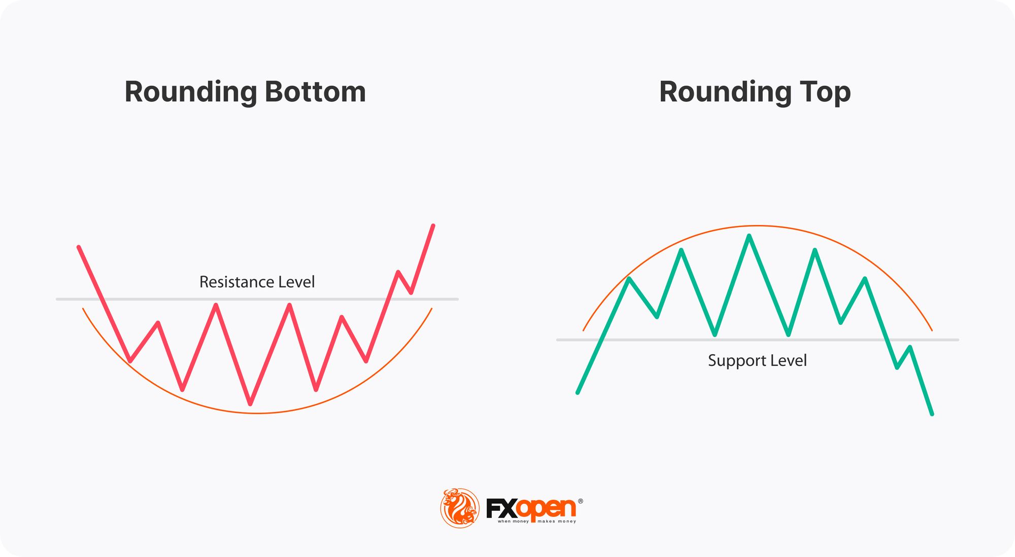
The Rounding Bottom and Rounding Top are gradual reversal patterns that form over a longer period, resembling a smooth, curved shape.
A Rounding Bottom occurs when the price slowly transitions from a downtrend to an uptrend, creating a bowl-like shape. This pattern suggests that sellers are gradually losing control, and buyers are starting to take over, indicating a potential shift to an upward trend.
Conversely, a Rounding Top forms when the price slowly moves from an uptrend to a downtrend, creating an inverted bowl shape. This formation indicates that buying momentum is fading, and a downward trend may be emerging.

These patterns are validated when the price breaks out of the curved formation—upward for a Rounding Bottom and downward for a Rounding Top—confirming the potential trend reversal.
Unusual Patterns
Uncommon crypto chart patterns can offer powerful insights, too. Some of the most important are:
Diamond
The Diamond is a unique chart pattern. It forms when the price action first widens and then narrows, creating a shape that resembles a diamond. This pattern typically appears after an extended trend—either up or down—and suggests that the market is at a turning point. In a bullish scenario, the price breaks out above the diamond, indicating a potential upward reversal. In a bearish scenario, the price breaks below the diamond, suggesting a possible downward reversal.
The Diamond pattern is often considered a sign of increasing uncertainty in the market. Traders look for a clear breakout in either direction to validate the pattern.
Quasimodo
The Quasimodo is a lesser-known but powerful reversal pattern that signals a potential change in trend. It resembles a distorted head and shoulders, with one of the shoulders significantly higher or lower than the other.
In a bearish Quasimodo, the price forms a high (left shoulder), followed by a higher high (the head), a lower low, and then a lower high (the right shoulder). This formation suggests that the upward momentum is weakening, signalling a potential downward reversal.
Conversely, a bullish Quasimodo shows a low (left shoulder), followed by a lower low (the head), a higher high, and then a higher low (the right shoulder), indicating a potential upward reversal.
Validation occurs when the price breaks past the last low (bearish) or high (bullish), confirming the pattern and suggesting the trend reversal is likely to continue.
Bart Simpson
The Bart Simpson is an unusual and distinctive chart pattern named for its resemblance to the spiky hair of the cartoon character Bart Simpson. It typically signals a rapid and sharp price movement followed by a period of sideways consolidation, and then an equally sharp reversal back to the original price level.
This pattern often appears in volatile markets, where sudden price spikes or drops are quickly corrected. In a bullish Bart Simpson, the price surges up quickly, moves sideways for a while, and then drops sharply back to where it started. In a bearish version, the pattern occurs in reverse.
Traders view this pattern as a sign of market manipulation or temporary imbalances, and it’s usually confirmed when the price sharply returns to its original level, completing the "Bart" shape.
The Bottom Line
Understanding chart patterns is crucial for effective trading in volatile markets. By incorporating these patterns into your analysis, you can enhance your ability to navigate market trends. To take your trading to the next level, consider opening an FXOpen account. FXOpen offers crypto CFDs, alongside access to over 600 markets and low-cost and high-speed trading.
FAQ
What Are Crypto Charts?
Crypto charts are visual representations of cryptocurrency price movements over time. They display data like price, volume, and timeframes to help traders analyse market trends.
Do Chart Patterns Really Work in Crypto Trading?
Yes, chart patterns can be effective in crypto trading, though they are not foolproof. They help traders identify potential market movements, but it’s important to use them alongside other analysis tools due to the volatility of the crypto market.
How to Spot Trends in Crypto?
Spotting trends in crypto involves analysing chart patterns and trend technical indicators. By identifying consistent price movements, traders can anticipate potential market movements.
What Charts Should Crypto Investors Use?
Crypto investors often use candlestick charts, line charts, and bar charts. Candlestick charts are particularly popular as they provide detailed information about price action and are useful for spotting patterns and trends.
At FXOpen UK and FXOpen AU, Cryptocurrency CFDs are only available for trading by those clients categorised as Professional clients under FCA Rules and Professional clients under ASIC Rules, respectively. They are not available for trading by Retail clients.
This article represents the opinion of the Companies operating under the FXOpen brand only. It is not to be construed as an offer, solicitation, or recommendation with respect to products and services provided by the Companies operating under the FXOpen brand, nor is it to be considered financial advice.
Stay ahead of the market!
Subscribe now to our mailing list and receive the latest market news and insights delivered directly to your inbox.


